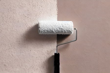
A new year and, in this case, a new design cycle, always brings a renewed sense of creativity into the home. As more homeowners look for ways to create spaces that feel uplifting, expressive, and deeply personal, color choices are taking center stage. While trends fluctuate, the growing emphasis on comfort, natural influence, and emotional balance is shaping a fresh palette heading into 2026.
If you’re thinking about refreshing your home, even a few strategic color changes can make a dramatic impact. Whether you’re preparing your home for long-term enjoyment or positioning it for future resale, intentional color design adds both value and appeal. Here are three standout color combinations to consider in 2026, each with a unique personality and versatility suited for modern homes.
1. Warm Clay + Soft Blush + Matte Black: Grounded, Modern, and Comforting
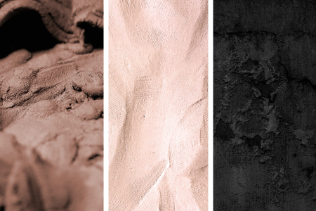
One of the strongest design movements heading into 2026 is the shift toward grounded, earth-inspired tones that feel warm and nurturing. This palette- warm clay, soft blush, and matte black- brings subtle sophistication into the home without feeling overwhelming.
Why it works:
Clay and blush are gentle earth tones that create a sense of calm and comfort. When paired with the strong presence of matte black, the combination achieves a beautiful balance between softness and structure. The result is a palette that feels warm and contemporary at the same time.
Where to use it:
- Living rooms: Clay walls create a comforting backdrop, while blush textiles—like throw blankets, rugs, or art—add a gentle, airy layer. Incorporating matte black lighting or hardware adds modern contrast.
- Bedrooms: Soft blush bedding feels serene, while black-framed artwork or furniture offers clean definition. Clay accents warm up the entire room without dominating it.
- Entryways: A clay-painted accent wall paired with black hardware and blush décor creates a memorable first impression.
Why homeowners love it:
This palette feels timeless yet fresh, especially for those wanting a cozy home that remains upscale. For homeowners preparing for future sale, it’s a pleasant choice- appealing to many buyers without feeling generic. The combination is both personal and polished, which gives the home a sense of intentional design.
2. Deep Navy + Fresh Sage + Aged Brass: Luxe, Natural, and Versatile
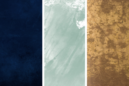
Nature-inspired design continues to influence color choices, but in 2026, these tones are becoming richer, more refined, and more layered. Deep navy, fresh sage, and aged brass create a palette that feels both classic and modern, making it an ideal choice for homeowners who love a sophisticated yet welcoming environment.
Why it works:
Navy is timeless and dependable, while sage introduces an uplifting natural element. Aged brass becomes the binding element, adding warmth, shine, and old-world charm. When combined, the palette feels elevated without becoming formal or restrictive.
Where to use it:
- Kitchens: Navy cabinetry has become increasingly popular and pairing it with sage walls or tile and brass fixtures creates a stylish but approachable space.
- Bathrooms: Sage walls and navy vanities look serene and spa-like, with brass hardware providing a beautiful finishing touch.
- Offices or libraries: Navy built-ins paired with sage upholstery and brass lighting create a cozy, professional atmosphere.
Why homeowners love it:
This palette adapts beautifully to both traditional and contemporary homes. Its rich, layered appearance gives spaces a tailored feel, which often enhances perceived value. Homeowners who prefer something more expressive than neutrals- but still timeless- find this combination especially appealing.
3. Soft Mushroom + Mist Blue + Warm Gold: Airy, Light, and Refreshingly Modern
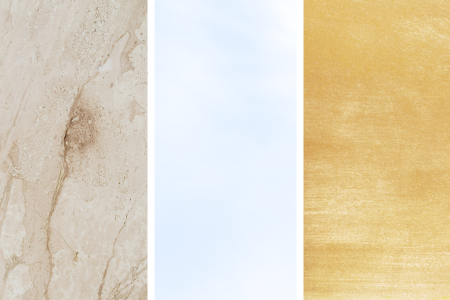
For those who gravitate toward gentle, bright, and effortlessly elegant interiors, this palette is a standout choice for 2026. Soft mushroom, a warm neutral with a subtle gray-beige undertone, pairs beautifully with mist blue—a color that feels clean, calming, and quietly optimistic. Warm gold completes the combination with a touch of playful luxury.
Why it works:
Mushroom offers a comforting foundation that works with virtually any style. Mist blue introduces a refreshing, airy quality without being too bold or too pastel. Warm gold accents bring life and depth to the palette, giving it a sense of refinement and warmth.
Where to use it:
- Open-concept living areas: Mushroom walls provide a seamless backdrop, while mist blue accents—like throw pillows, ceramics, or window coverings—add a gentle sense of movement. Gold lighting elevates the entire space.
- Primary bedrooms: Mist blue bedding against mushroom walls creates a spa-like retreat. Gold-framed mirrors or bedside lamps introduce subtle elegance.
- Dining rooms: A mist blue sideboard or rug with mushroom walls and gold-hued lighting creates an inviting, cheerful space for gathering.
Why homeowners love it:
This combination is ideal for anyone who wants a modern, serene home without leaning too heavily into cool tones. It feels fresh, clean, and harmonious. It’s also a flexible palette that photographs exceptionally well, which is helpful if you’re considering future marketing or listing preparation.
Bringing It All Together
Each of these three color combinations reflect the direction homeowners are gravitating toward in 2026: grounded comfort, natural sophistication, and refreshed simplicity. Whether you’re updating a single room or considering a whole-home design shift, these palettes offer both beauty and long-term appeal.
Thoughtful color choices also contribute meaningfully to your home’s value and livability. If you’re planning updates with a future move or investment goals in mind, partnering with an experienced, well-connected real estate professional can help you prioritize design choices that resonate widely while still feeling uniquely your own. A new year is the perfect time to experiment, refresh your space, and create a home that inspires you daily—and the right color palette is a simple, high-impact way to start.