While there are many different style preferences when it comes to your home, every homeowner can agree that the goal of their home is to be an oasis among a hectic life. Not everyone can afford (or find space) to install a Zen garden, but there are plenty of other options to bring relaxation into the house. The easiest method is to choose colors that promote relaxation effortlessly.
Scientists have found that colors can evoke emotions. Just as clashing neon pieces can sometimes induce uneasiness, calm, cool colors can help you unwind. Read on to learn more about some color palettes that can provide some peace and calm in your home.
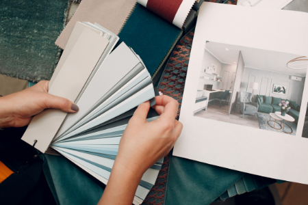
Exploring Color Options
Blue tones are seen as peaceful, calm, and cool. According to the Times of India, blue is “a very soothing color that helps calm your mind, slow down your heart rate, lower your blood pressure and reduce anxiety. Blue is believed to have a cooling and astringent effect.”
Green is a color that surrounds us and is innately linked with nature, a place many seek out for relaxation. It is positive in many other ways. This article on the psychology of green states that the color is associated with many affirmative phrases such as getting “the green light” or “the grass is greener.” Though keep in mind, green is a color that can range from deep, soothing greens to high-energy neons. It’s important to pick a great middle ground.
White can be tricky but can be extremely therapeutic when done right. One extreme example of this is a hospital or medical office that provides a sterile, unwelcoming atmosphere. The other end of the spectrum is a white room with accent pieces to create a clean-cut look, often used in feng shui designs. Very Well Mind says, “white is bright and can create a sense of space or add highlights. Designers often use the color white to make rooms seem larger and more spacious.”
Like white, grey is sometimes cited as dull and an energy zapper. Taking a grey, moody sky tone and covering a room in it may not be for you. But grey is cool and thus very soothing for many. Often paired with white and blue components, the color can be a great base level to start a design. According to Oberlo, grey can be a sign of neutrality and balance.
Yellow has long been a color of hope and renewal. Representing the sun, brightness, and light, it’s easy to see why the color might promote relaxation in a home. Vincent Van Gogh is one of the color’s biggest fans, saying, “How wonderful yellow is. It stands for the sun.” Depending on the undertones and vibrancy of the yellow you choose, you’ll be able to achieve anything from warmth to energy.
Feeling ambitious? Violet and pink are also generally considered positive colors, both representing florals and youthfulness. Adding touches of the colors will brighten a space, making it happier and more soothing to lounge in.
Mix and Match Colors
You may choose to break down the colors by room, focusing on promoting unique relaxation according to each part of your home. Consider pulling inspiration from your favorite places. For example, many spas use a white and grey color palette to promote relaxation without distractions- a perfect color scheme for bathrooms and bedrooms. Larger areas like living rooms or dining rooms provide an opportunity to experiment with color without overwhelming the entire house. A splash of yellow or a complex patterned wallpaper can be interesting when there is enough space to enjoy the focal point.
Minimalist Approaches
If you’re prone to changing your mind, keeping a blank canvas on the walls can be a great option so that furniture and accessories can provide the color and interest to the room. Accenting with violet pillows or yellow throw blankets keeps the underlying calmness at the center of the home while also keeping things lively. In addition to considering the colors for the accessories, also think about quantity. Be sure to avoid decorating your space with pieces that clutter or make the room feel small- it can negate the relaxation you’re hoping to achieve.
In Conclusion
If you are looking for ways to make your home more peaceful, consider taking the next step and buy that can of paint. You can get creative with your palette or simplify it, based on your style. It’s an inexpensive change but invaluable to your rest and relaxation!
386-506-8008 | Oceanside@RealtyExecutives.com |  |
|